Grok Logo’s Cosmic KO: Jon Vio’s Minimalist Branding Triumph

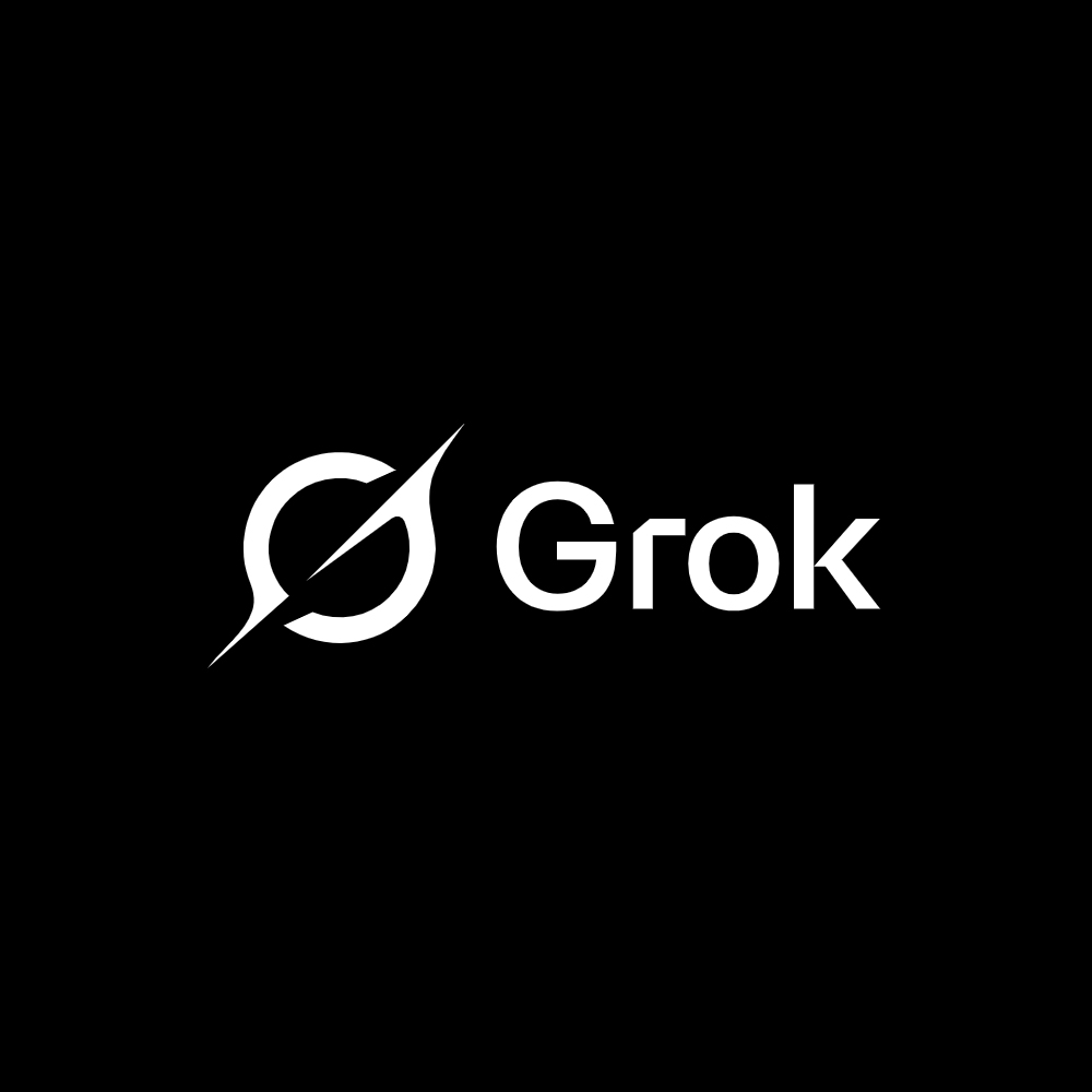
Picture a logo that hits like a cosmic punch — mysterious, powerful, and unforgettable. That's the new Grok logo, unveiled by xAI in February 2025, and it's a knockout from designer Jon Vio. A sleek, swirling "G" that doubles as a black hole, this minimalist masterpiece isn't just eye candy — it's a branding triumph that perfectly captures Grok's ethos. For those of us at BrandBoxd obsessed with sharp design, this is a moment worth dissecting. So, who's Jon Vio, what's behind this Grok logo, and why does it prove minimalist branding is still king?
The Big Reveal: Elon Musk's First Look
The anticipation reached its peak when Elon Musk himself shared the first glimpse of the new Grok logo on X. The reveal sparked immediate buzz in both tech and design communities, with the logo's elegant simplicity drawing widespread praise.

Source: Elon Musk on X
Meet Jon Vio: The Multi-Planetary Design Maverick
Jon Vio isn’t your average designer — he’s a visionary who’s left his mark across the galaxy. Literally. The guy behind NASA’s Mars 2020 mission logo, Vio’s work has touched down on Mars, and now he’s shaping the future of AI with xAI. Visit jonvio.com, and you’ll see a portfolio packed with heavy hitters: Stripe, Adobe, mymind, and more. His Instagram (peep the Grok reveal here) showcases a designer who thrives on turning big ideas into clean, bold visuals. With Grok, Vio took xAI’s mission — deep understanding, cosmic curiosity — and distilled it into a single, gravitational stroke.
The Grok Logo: Minimalism Meets Cosmic Cool
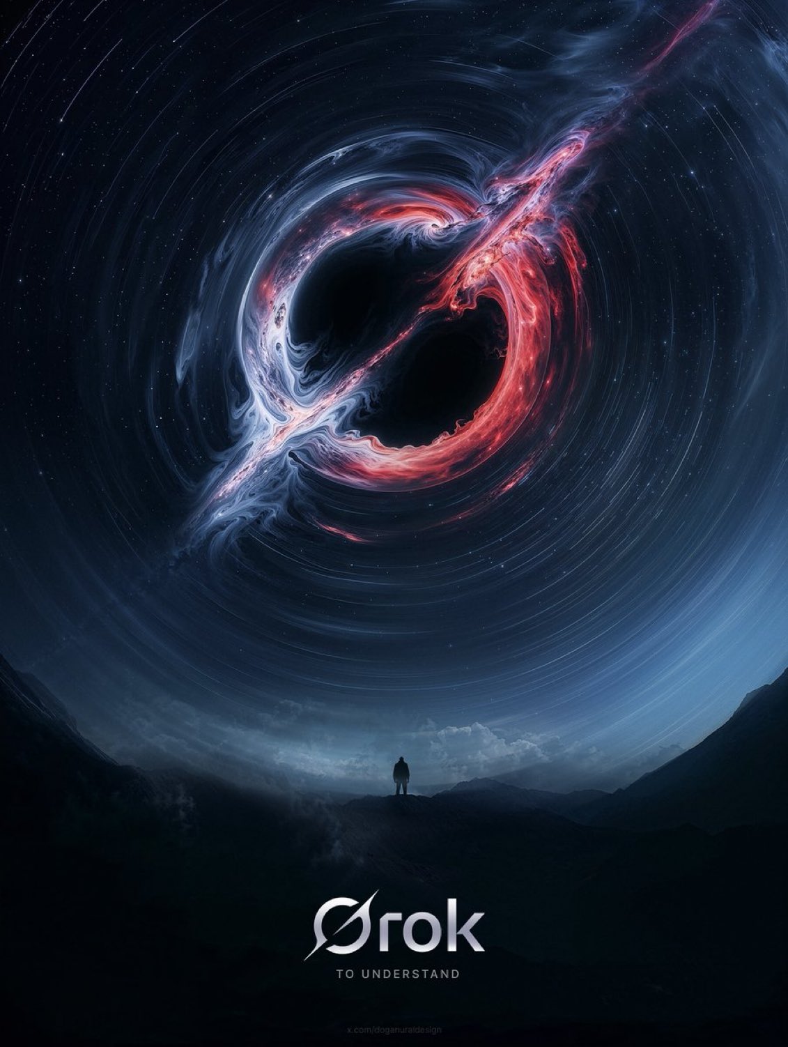
Launched just days ago as of February 27, 2025, the new Grok logo is a stunner. A flowing, black-and-white form that evokes a black hole's pull, it's both a "G" and a symbol of infinite potential. Paired with "Grok" in a crisp, sans-serif font, it's futuristic yet timeless.
This isn't a logo that shouts — it whispers with confidence, letting its simplicity do the talking. For an AI built to unravel the universe's mysteries, it's a pitch-perfect match.
What makes it work? It's minimalist branding at its finest. Jon Vio didn't clutter it with bells and whistles; he stripped it to the core, proving less can hit harder. The black hole nod ties into xAI's ethos — think singularity, depth, and a touch of rebellion — while keeping the design razor-sharp.
Why Minimalist Branding Wins: Lessons from Grok
Great brands don't need to overexplain — they just are. The Grok logo nails three pillars of standout branding:
- Purpose in Every Pixel: That black hole swirl isn't random — it mirrors Grok's mission to suck in questions and spit out brilliance. Jon Vio baked the ethos right into the design.
- Simplicity Packs a Punch: Minimalism isn't about being boring; it's about focus. The Grok logo ditches distractions, letting its core idea shine.
- Emotion That Sticks: A good logo doesn't just sit pretty — it pulls you in. This one's got a quiet intensity that hooks you, much like Grok's AI smarts.
Vio's track record backs this up. His Mars 2020 logo was a single, elegant glyph that carried humanity's hopes to another planet. With the Grok logo, he's delivered another minimalist gem that stands tall in a crowded tech world.
A BrandBoxd Take: Why This Matters
At BrandBoxd, we live for brands that push the envelope while keeping it real. The Grok logo is a wake-up call for anyone drowning in flashy, overdone designs. In a sea of visual noise, Jon Vio's minimalist branding cuts like a laser. It's proof that a single, well-crafted idea can outshine a thousand gimmicks. For xAI, it's not just a logo — it's a statement: Grok is here, it's sharp, and it's ready to redefine AI.
Next time you're brainstorming your own brand, take a cue from Vio's playbook. Dive into his work at jonvio.com or scope his process on Instagram (this post, specifically). The Grok logo isn't just a win for xAI — it's a minimalist branding triumph that shows how to stand out by stripping back. Cosmic? Yes. A KO? Absolutely.